/ Context
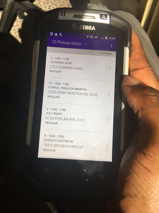
I came to FedEx Services to work on the experience where couriers perform pickup and delivery business operations.
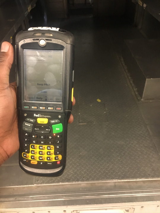
This came in as FedEx was working with a design firm that was figuring out FedEx’s business operations and how reliant couriers were on their primary PowerPad devices.
I was placed into the position of being the most exposed to the business and product owners while collaborating with this design firm to migrate these courier workflows to a new device.
This was a monumental task since FedEx has a myriad of various backend systems, legacy business flows, and couriers who fulfill countless different operation pressures within the company.
How could we have all these operations speak through one design language while couriers have a smooth transition relearning the UX and visual patterns on their new mobile device?
Type
Deep Dive
Role
UX Research, (Lead) UX & UI Designer, Creative Direction, Visual Design
Tools
Figma
Sketch App
/ "Designing" for the Design System
This new device running Logistics Enhancing Operations (LEO) must be able to be the driver for the courier’s job responsibilities each day all over the world such as:
- Picking up and receiving packages between the station and the customer
- Verifying the customer has received a package
- Complying with the strict FedEx business and legal rules on handling (dangerous) goods
- Managing the courier’s timecard and communication with Dispatch and station managers
- Applying special condition exceptions & operations on packages which may or may not be monetary
These examples barely scratch the surface on what a specific FedEx courier may do inside or outside their station, but during final state of LEO, it had been managing over 10 different apps all under one design system language.
The design agency and I, after years of research and design iterations, pushed LEO’s design system to be a unique descendent of Google’s Material Design practices while having a holistic modular design approach inspired by Atomic Design by Brad Frost. There is a large technical solution with the development of a block library that is associated with the design system, but that is out of scope for this deep dive.
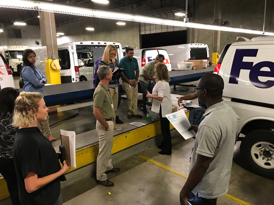
Designing and building components as part of an evolving system takes a long time, and the designers who were a part of this system continued to ebb and flow until it was solely myself as a UX Team Of One who led the design moving forward.
For nearly a decade, FedEx worked with multiple designers to create this design system, and for latter part of those 5 years I was on this project, I built, evolved, and managed an app suite’s internal design system to tackle FedEx’s complicated problem of evolving its previous PowerPad device into LEO.
/ What were the principles we aimed to follow?
To begin, we needed a design system where our team can:
- Provide consistency for how UI foundations and block elements were used
- Guide our designers & developers on how design patterns should be used in LEO
- Document the recommended product language
FedEx’s operations required their future mobile workforce to have access to a system that builds around enhancing new opportunities for customer needs and enabling its business goals. This allowed us to design principles that myself, the design team, and the business team were focused on:
Aware.
Usage of progressive disclosure in design system and only give the user something to do if they need to do it at that time. Reduce the number of mistakes by contextualizing users’ options, leverage ambient info, and catch mistakes before they happen.
Accurate.
Ensure clean data across systems and that the user understands what information is going into where. Simplify the front-end by only focusing on information that the user needs to see at that moment. Use precise data inputs, and reduce human error by setting the user up for success.
Fluid.
Design system should be flexible to allow for the changing situations in the landscape and within the FedEx business. Streamline the UX. Minimize the user screen time. Guide with consistency.
Keeping the system aware, accurate, and fluid, how did we evaluate a design during the research phase through what metrics?
- Effectiveness: How well were couriers able to perform a task?
- Efficiency: Were couriers able to perform a task within an error range?
- Intuitiveness: Where couriers able to a task within an expected time frame?
- Ergonomics: Did the courier perform the task within expected interactions? How did they change?
/ Strategy
Focus on Lean Product Strategy through Agile Development Process

Audience
Couriers
- "LEO feels just like I am using my phone."
- "LEO is easy to use."
- "I can trust LEO to help me do my job every day."
- "This is a much better experience than using a dinosaur like PowerPad."
Product Owners
- We can easily build out new features requested by regions around the world.
- We can fulfill the business needs with less design and engineering resources.
- We can discuss wireframes between departments easily.
Designers
- When there is a component that doesn’t exist, we can create one and talk to the development team with compatibility with the block library.
- We do not have to redo basic LEO patterns over and over when designing.
- We can teach product owners and developers easily with the use of the design system.
Developers
- We can compare our internal block library with the design system’s specifications.
- We do not have to worry about design and technical debt with duplicate work.
- All the components for our UX can be compared between our development blocks and Figma library.
Framework Patterns

LEO is like an onion with how it utilizes progressive disclosure to guide our couriers throughout FedEx's business goals. According to The Interaction Design Foundation, it is an interaction design technique that sequences information and actions to reduce feelings of the user being overwhelmed. LEO walks the courier, regardless of their expertise, through the expected business flow step by step through unpeeling its layers based on the courier’s decisions.
Basically, our design system allows FedEx’s multiple business flows to slowly unravel as the courier inputs the required information only at the time when it is needed. Workflows, such as a pickup or a delivery, require the user to enter information in a specific order.
Each required step must be completed before the UI allows the user to enter the next tailored step in the sequence. Once all the required steps are complete by the courier, there will be a prominent button that pushes the courier forward.
Think about a happy path scenario where a courier is about to deliver packages to a building. The courier will get out of their truck and scan all the packages belonging to that building. LEO will use this technique to guide them throughout the business flow as if it were a conversation:
- What kind of stop is it? Is it a residential or a business?
- Is the recipient home? If not, then what is happening?
- LEO opens a signature screen overlay which rotates into a branded and dedicated view for the recipient to sign. The recipient signs using their finger or a stylus pen to confirm that they received all the packages and taps a button to confirm their signature. This will change the screen back to a familiar portrait view for the courier.
- Where did you have the customer sign the packages at? Was it at their front door or elsewhere?
- Do you have comments about this stop? Did the customer say anything that the business needs to know?
- LEO reveals a massive “END STOP” button at the bottom of the screen which has a layer above the context view where the courier can then go back to the package manifest view.
Of course, I obscured and simplified plenty of the divergent paths which could possibly happen at that stop for brevity (and discussion of FedEx Express’s business flows are not for discussion) in this example, but as the courier continues to peel away the onion, the design system cadapts and reveals the appropriate next layer.
/ Style Guide Example Component
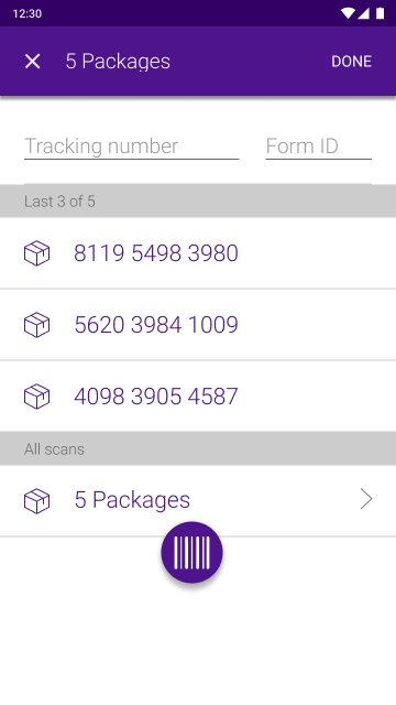
Package List Item
What is it?
Anytime a tracking number is scanned using the software scan button on the screen or scanned using the device’s hardware scan button, use the package list item to display it as a list item in the overlay.
In general, the scanned purple list item block should be used when displaying the tracking number of a package that has been scanned from:
- Any single scan screen or "multi-scan" scan screen within a workflow
- Delivery stop detail when a package has ready for delivery
- Pickup stop detail when a package is a regular pickup or a pickup exception
States
Forecast/Unscanned: This block is only used on the delivery stop detail or delivery plan to represent the known relationship of a package to a stop. It indicates that the package has yet to be scanned for delivery to the customer.
Scanned: This block is generally used when a user scans any tracking number within LEO.
Actionable: This block represents a scanned packaged list item that allows additional actions to be performed on it. It can also tag groups of similar tracking numbers together. This usually will invoke a new overlay for a courier to proceed in a workflow.
Usage


/ Deliverables
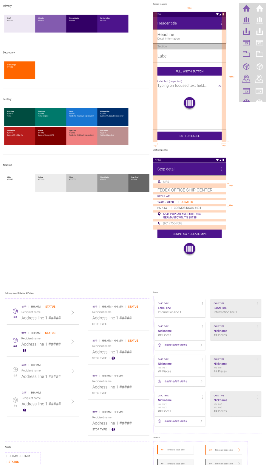
An example of components sliced from the full design to showcase wireframe creation for teams to rapidly design and prototype ideas.
/ Lessons learned
How did I generally spend my time?
- Responsible for designing wireframes in Figma
- Maintaining an internal design system
- Implementing new design patterns
- Facilitating weekly UX workshops for business and development teams
My 7-year journey working on this design system with the support of some amazing talented designers into transitioning as a UX of One has been incredible. I think the best way to tie a bow on this project into some key takeaways:
- The design of your product must be adaptable and be prepared to account for many unforeseen scenarios where couriers rely on you and your team’s design craft.
- FedEx is a unique company where it has many diverse people who want to put their hands in the cookie jar and influence the product. Learn how to say no, or your team would bite off more than what they could chew.
- Storytelling is the most important skill we need to improve as product designers. When something ignites on fire from an oversight released onto the field, the team morale may grow into panic. Good design is good communication!
- Continuously listen to your users to create a great product. At FedEx, courier trust is critical, and if they do not feel like your tool would solve their problem in the immediate, then your team would know.
- Design system migration (especially with minimal resources like as a UX of One) is very tricky, but achievable. It is important to have a foundation and a plan.